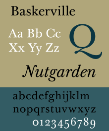
Baskerville
 |
|
| Category | Serif |
|---|---|
| Classification | Transitional serif |
| Designer(s) | John Baskerville |
| Foundry |
G. Peignot et Fils Linotype |
| Variations | Mrs Eaves |
| Shown here | Baskerville Ten by František Štorm |
Baskerville is a serif typeface designed in the 1750s by John Baskerville (1706–1775) in Birmingham, England and cut into metal by John Handy. Baskerville is classified as a transitional typeface, intended as a refinement of what are now called old-style typefaces of the period, especially those of his most eminent contemporary, William Caslon.
Compared to earlier designs, Baskerville increased the contrast between thick and thin strokes, making the serifs sharper and more tapered, and shifted the axis of rounded letters to a more vertical position. The curved strokes are more circular in shape, and the characters became more regular. These changes created a greater consistency in size and form. Baskerville's typefaces remain very popular in book design and there are many modern revivals, which often add features such as bold type which did not exist in Baskerville's time.
Baskerville's typeface was part of an ambitious project to create books of the greatest possible quality. Baskerville was a wealthy industrialist, who had started his career as a writing-master (teacher of calligraphy) and carver of gravestones, before making a fortune as a manufacturer of varnished lacquer goods. At a time when books in England were generally printed to a low standard using typefaces of conservative design, Baskerville sought to offer books created to higher-quality methods of printing than any before, using carefully made, level presses, a high quality of ink and very smooth paper pressed after printing to a glazed, gleaming finish.
Having been an early admirer of the beauty of Letters, I became insensibly desirous of contributing to the perfection of them. I formed to myself ideas of greater accuracy than had yet appeared, and had endeavoured to produce a Set of Types according to what I conceived to be their true proportion...It is not my desire to print many books, but such only as are books of Consequence, of intrinsic merit or established Reputation, and which the public may be pleased to see in an elegant dress, and to purchase at such a price as will repay the extraordinary care and expense that must necessarily be bestowed upon them.
While Baskerville's types in some aspects recall the general design of William Caslon, the most eminent punchcutter of the time, his approach was far more radical. Beatrice Warde, John Dreyfus and others have written that aspects of his design recalled his handwriting and common elements of the calligraphy taught by the time of Baskerville's youth, which had been used in copperplate engraving but had not been previously been cut into type. Such details included many of the intricate details of his italic, such as the flourishes on the capital N and entering stroke at top left of the italic 'p'. He had clearly considered the topic of ideal letterforms for many years, since a slate carved in his early career offering his services cutting tombstones, believed to date from around 1730, is partly cut in lettering very similar to his typefaces of the 1750s. The result was a typeface cut by Handy to Baskerville's specifications that reflected Baskerville's ideals of perfection. According to Baskerville, he developed his printing projects for seven years before finally releasing his first book, an edition of Virgil, in 1757, which was followed by other classics.
...
Wikipedia
