Perpetua (typeface)
 |
|
| Category | Serif |
|---|---|
| Designer(s) | Eric Gill |
| Foundry | Monotype Corporation |
| Date released | 1929 |
| Variations | Perpetua Titling |
Perpetua is a serif typeface that was designed by English sculptor and stonemason Eric Gill for the British Monotype Corporation. Perpetua was commissioned at the request of Stanley Morison, an influential historian of printing and adviser to Monotype around 1925, at a time when Gill's reputation as a leading artist-craftsman was high.
With a delicate structure influenced by Gill's experience of carving lettering for monuments and memorials, Perpetua is commonly used for covers and headings and also sometimes for body text. Perpetua was released with characters for the Greek alphabet and a matching set of titling capitals for headings.
Perpetua is named for the Christian martyr Vibia Perpetua, a text by whom was used in one of its first showings; its companion italic is named "Felicity" for her companion of that name. The choice had appeal to Morison and Gill, both converts to Catholicism.
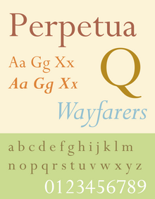
Perpetua is generally classified as a transitional serif font, in the vein of British fonts such as Baskerville from the late 18th century and stonecarved (lapidary) inscriptions in the same style, without directly reviving any specific historical model. Characteristic features in Perpetua include considerable contrast in stroke width, crisp horizontal serifs, a delicate colour on the page and a reasonably vertical axis, with letters such as ‘O’ having their thinnest points at the top and bottom.
Along with these characteristics, Perpetua bears the distinct personality of Gill's characteristic preferences in carving monumental lettering for uses such as tombstones, dedications and war memorials. Fine book printer Christopher Sandford of the Chiswick Press, who knew Gill, commented that "all Gill's types…are variants of Gill's own very lovely, very personal hand-lettering." Letter designs in Perpetua common in Gill's work include the 'a' that forms a sharp point without serif, the extended leg of the 'R' and the flat-topped 'A'. In italic, the 'a' has a smooth top and the 'g' is a "single-storey" design recalling handwriting. The top of the 'f' has a wedge-shaped serif. Historian James Mosley suggests that a rubbing of a 1655 engraving at Rye may have been an influence on the design. Perpetua's italic also has some flourishes in the capitals, but rather than being fully cursive in style some characters resemble oblique type, a style rarely used for serif fonts in which letters are slanted but do not take on as many handwriting characteristics as in a "true italic". Examples of this are the flat foot serifs on letters like 'h', 'm' and 'n', where most body text italics would have a curl or no serif at all.
...
Wikipedia
